


You notice it in a screenshot, usually. Someone sends you the page in dark mode and one of the numbers is gone. Not faint. Gone. There is a card, there is a heading, there is a description, and where the deep brand navy used to sit there is nothing at all.
It was there the whole time. It was just the same colour as the thing behind it.
Where the problem starts
A brand palette is almost always built against white. White paper, white artboard, white presentation deck. The darkest value in the system does the heavy lifting, because on white it has maximum contrast and maximum authority. That is the colour that ends up on the letterhead, the business card, the wordmark.
Then the same palette gets handed to a website that has a dark theme. The card that was white is now near-black. The colour that had the most contrast in the world now has almost none.
Nothing in the palette is wrong. The palette was never asked this question.
Why inversion does not fix it
The instinct is to flip everything. Light becomes dark, dark becomes light, job done. It works for a wireframe and falls apart for a brand.
Inverting a brand colour gives you a colour that is not in the brand. The deep navy becomes a pale wash that nobody approved. The warm burgundy becomes a pink. You have solved a contrast problem by quietly redesigning the identity, which is a much larger problem wearing a smaller problem’s clothes.
The other instinct is to lighten the background instead. Raise the card until the dark colour reads. Now the dark theme is not dark, and the whole reason someone switched to it is gone.
What actually works
Two things, and neither is clever.
The first is to accept that some colours have a job in one theme and no job in the other. A near-black accent is doing real work on white. On a dark card it has no work available. Rather than distorting it, we retire it for that theme and replace it with a neutral at a fixed opacity. It is not the brand colour, but it was never going to be readable as the brand colour, and a legible neutral is closer to the intent than an invented tint.
The second is to stop treating the dark theme as one surface. A dark page is not a single value. It is a page, a raised element, and a recessed element, and those three need to be different or every card in the layout floats in undifferentiated black. Once you have that hierarchy, you know exactly what each colour has to survive against.
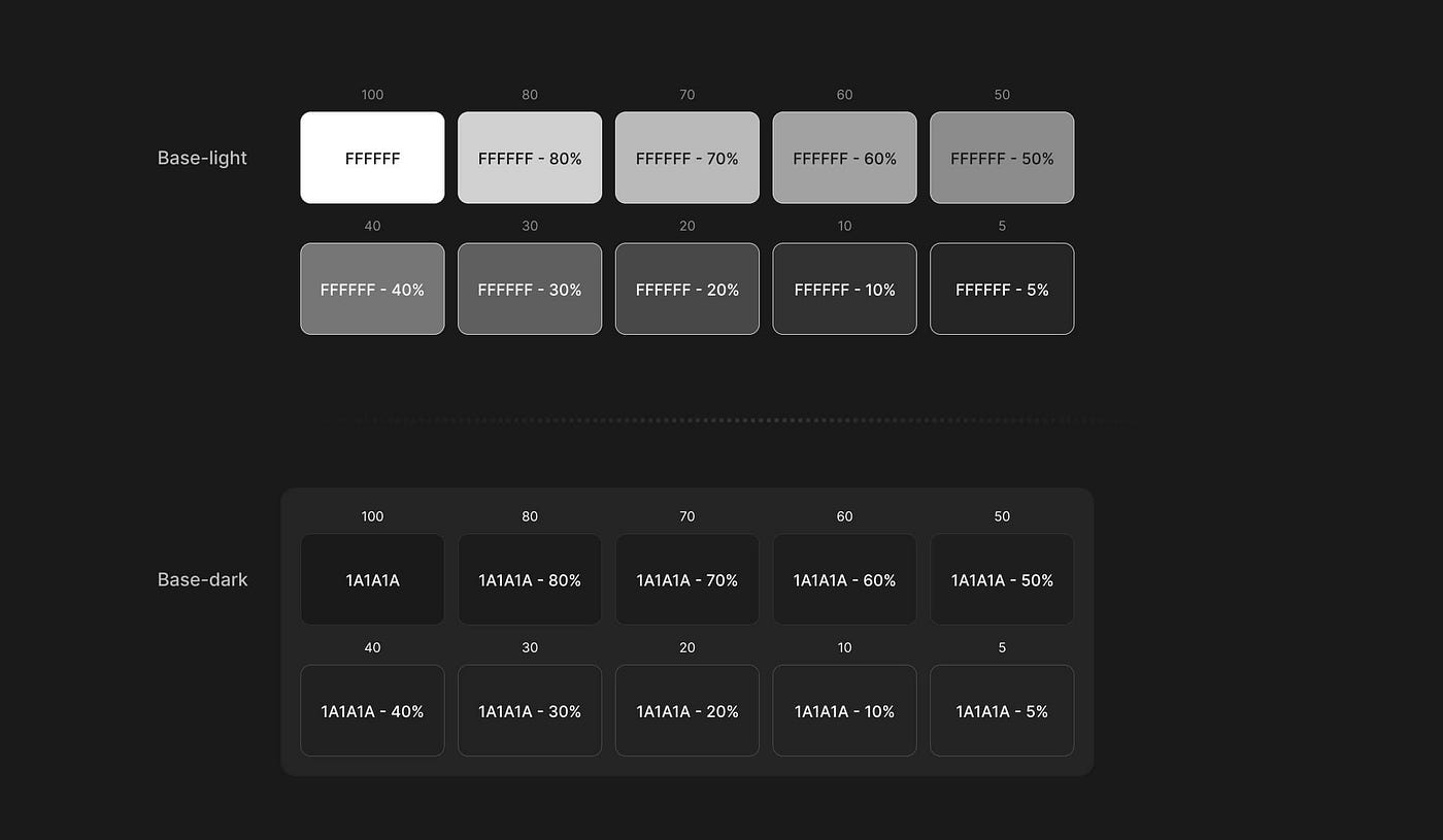
This is the clearest illustration of the idea we have seen. Two base colours, white and a near-black, each stepped down through the same opacity ramp. On the light base the steps behave the way you expect. Every reduction moves visibly away from the last, and the whole range stays usable from top to bottom.
On the dark base something different happens. The lower half of the ramp collapses. Forty per cent, thirty, twenty, ten, they are all recognisably the same near-black, separated by a difference you can measure but not really see. The steps exist in the file. They do not exist on the screen.
That is the whole problem in one image. Dark surfaces have far less room to work with than light ones, so the tiers have to be chosen deliberately rather than generated from a formula. Three values that are obviously distinct will serve you better than ten that technically differ.
The rule
We check every brand colour against the darkest surface it will ever land on. Anything meaningfully darker than the midpoint gets an explicit override for that theme. Light and vivid colours pass without changes. Teals, golds, oranges, warm mid-tones, they all hold up because they were never relying on the background to do the work.
The check takes minutes. Finding it in production takes a screenshot from a client and a slightly uncomfortable reply.
The wider point
Dark mode is not a filter you apply at the end. It is a second set of conditions the design has to survive, and it deserves the same attention as the first set. Every value in the system gets asked the question twice.
Design for both, or design for one and be honest that the other is a guess.