


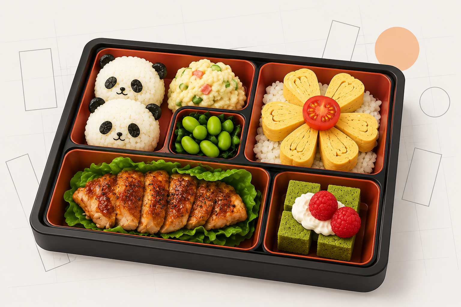
There is a form of tidiness that is also expressive. Not the sterile tidiness of empty space, but the satisfying organisation of a Japanese bento box, where rice, pickled vegetables, tamagoyaki and a few slices of karaage each occupy their own compartment, distinct but cohesive, varied but unified. It is a visual logic that has been quietly influencing design for decades, and in the last few years it has arrived fully formed on the web.
The bento grid is, at its simplest, an asymmetric arrangement of rectangular cells, each sized to the importance of its content, each fitting together without gaps. Some cells are wide. Some are tall. A few anchor the whole layout. None looks accidental.
From the lunchbox to the layout
The analogy is not an accident. The Japanese bento (弁当) has been a compartmentalised meal container since at least the sixteenth century, and the organisational principle, different things separated cleanly and presented in a single frame, is almost identical to what grid-based UI design has been reaching toward for years.
The Swiss typographers of the 1950s and 60s were working out the same idea in print. Josef Müller-Brockmann's grid systems and the International Typographic Style established that a layout could be structured by invisible columns and rows while still feeling dynamic and free. The grid was not a cage. It was scaffolding.
What the bento grid adds is variation in scale. A classical twelve-column grid treats every column as equal. A bento grid allows one cell to span four columns and two rows, another to sit small in a corner, creating a rhythm that is more like music than mathematics.
Apple changes everything (again)
The modern web bento grid has a specific origin story. In September 2022, Apple's iPhone 14 keynote used a slide layout where product features were presented in a tiled grid of differently sized cards: camera stats beside a full-bleed night mode photo beside a crash detection graphic. Each card was a different size. All of them fit.
Design Twitter immediately noticed. The language spread. Designers began calling this style "bento" and the name stuck, partly because it was accurate and partly because it was evocative. Apple continued using the approach across their product marketing pages, the M2 chip pages, the Apple Watch Series 8 site, the Vision Pro announcement. Each iteration refined the pattern.
What Apple demonstrated was not just a visual style but an information strategy. A bento layout lets you show many different things without them competing. The hierarchy is built into the size of each cell, not into typographic weight or colour contrast. Smaller cells carry supporting information. Larger cells carry the headline. The viewer's eye navigates naturally.

The web catches up
The pattern spread quickly once designers had a name for it. By 2023 it had become a signature layout for SaaS marketing pages, particularly in the developer tools and productivity space. Linear, Vercel, Raycast and Craft all began using bento grids to showcase product features, making it possible to present five or six distinct capabilities in a single section without resorting to a carousel or a bulleted list.
Portfolio sites followed. The grid is genuinely useful for showing diverse work: a logo in one cell, a full-page web design in another, a motion still in a third. The variety of the work reads as variety rather than inconsistency, held together by the logic of the enclosing frame.
Before all of this, the web had been building toward it in pieces. Pinterest's masonry layout (2010) introduced variable-height cards. Google's Material Design (2014) popularised cards as a UI primitive. Apple's iOS home screen widgets, introduced in 2020, brought the bento logic to millions of phones. The keynote slide in 2022 just named what was already almost there.
Why it works
Information density without chaos. That is the fundamental appeal.
A bento grid can carry more content than a conventional row-and-column layout while remaining readable, because the size differentiation does the work that whitespace usually does. You don't need large gaps to signal that things are separate. The cells are separate. The borders of each tile are the signal.
There is also something about the sense of completion. A well-constructed bento grid looks finished in a way that a loose collection of cards does not. The puzzle has been solved. Every piece fits.
And it rewards exploration. Smaller cells become something to discover, additional detail for the viewer who looks more closely. The large cells anchor you. The small ones reward you.
How I use it
I've been drawn to bento grids for a long time, probably before the name existed for them. The appeal is the same thing that draws me to considered interior design: different objects, each interesting on its own, arranged so the whole is more coherent than any individual piece.
You can see it at the top of the Octarine homepage. The bento there combines a rotating image slideshow, two looping video cells and a text cell, all sitting in a grid where no two cells are the same size. The effect is dense but not crowded. It tells several things at once without shouting any of them.
I reach for bento layouts whenever I need to show range. A single hero image tells one story. A bento grid tells five simultaneously and lets the viewer choose where to begin. For studios and product teams that do varied work, it is one of the most honest layouts available. The work itself determines the grid.
The constraints are the same as any grid: cells need to be sized with intention, not convenience. A bento where every cell is the same size is not a bento, it is just a grid. The variation is the point.