

Work that depends on scale, surface, or presence loses most of what it has when it goes through a screen. A canvas that takes up a wall becomes eight hundred pixels wide. A sculpture that you walk around becomes one fixed angle someone else chose. Texture goes first, then scale, then the thing the room was doing.
Every artist website starts from this loss. What separates the good ones is what they decide to do about it.
Two ways to get it wrong
The first is to fight the medium. Recreate the gallery in a browser. Full-bleed images, elaborate transitions, a virtual walkthrough, ambient sound, a cursor that does something clever. The reasoning is understandable: the work deserves an experience, so build one.
What actually happens is that the experience competes with the work. A viewer who is noticing the transition is not noticing the painting. You have added a second thing to look at in a context where attention was already scarce.
The second failure is the opposite. A site so minimal it withholds. Ten thumbnails, no dates, no dimensions, no medium, no way to enquire, no indication of whether the artist is alive or working or represented. Restraint applied to the wrong things. The work is not being protected, it is being hidden.
Documentation, not exhibition
The shift that fixes both is small and it is conceptual.
A website is not where the work happens. It is where the work is documented, contextualised, and made findable by the people who need to find it. Curators, collectors, writers, galleries, and the person who saw something in a room three months ago and is trying to remember who made it.
Once you accept that, the decisions get much easier. Dimensions matter, because someone is trying to understand scale they cannot see. Dates matter, because the sequence is part of the argument. Medium matters. Clear images at generous size matter more than clever ones. A way to make contact matters most of all, and it is astonishing how often it is missing entirely.
None of that is exciting to design. All of it is what the site is actually for.
A case in point
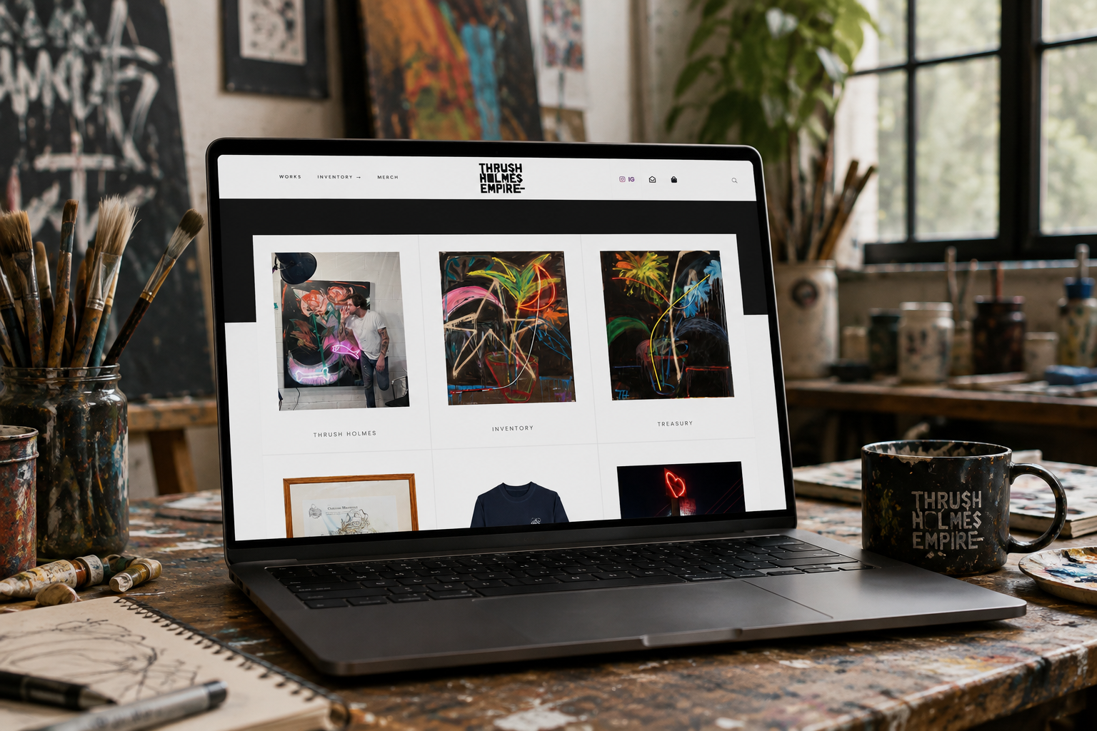
We have built several artist sites. One of them was for Thrush Holmes, a Toronto painter whose work sits in permanent collections at the Elton John AIDS Foundation, Sony Music, Dreamworks and Def Jam, among others.
His work is a near-perfect statement of the problem. Holmes builds paintings at twenty feet, often finished in a single sitting, and then sets neon into them within minutes of the paint going down, because he believes waiting costs the act its romance. The neon is not a flourish added afterwards. It is part of the painting and it is a light source.
Both of those things are exactly what a screen destroys. Scale collapses to whatever the browser window happens to be. And a physical light source photographs as a bright patch of colour, which is a description of neon rather than the experience of it. Standing in front of one of those paintings at dusk, the neon is doing something to the room. On a laptop it is a shape.
There is no clever interface solution to that. You cannot animate your way back to a light source. What the site could do was refuse to add anything else competing for attention, give the work as much room as the format allows, and make it effortless for a curator or collector to find what they came for and get in touch.
Where restraint belongs
The best artist sites we have seen are quiet in a specific way. They are not sparse. They are unhurried.
Space around the work, so it is not fighting the interface for room. Typography that has a point of view but does not perform one. Navigation that disappears when you are looking and reappears when you need it. Loading that is fast enough to be invisible, because nothing kills the encounter with a painting like a spinner.
The restraint is in the interface, not in the information. Give the viewer everything they need to know and nothing extra to look at.
The test
Someone leaves a gallery, half-remembers a name, and searches for it on their phone on the way home.
Do they find the artist. Do they understand what they saw. Can they get in touch before the impulse fades.
That is the whole brief. Everything else is decoration on top of a job that either got done or did not.